QuikVest, Education Meets Investing
Solution : 10 min Read
Process : 5-10 min Read
The Motivation
Imagine you're a recent college graduate, eager to start building your financial future. You've heard about the potential benefits of investing in mutual funds, but the jargon and complexity of the process seem daunting. You feel overwhelmed and unsure of where to begin, worried that a lack of knowledge might lead you to make uninformed decisions with your hard-earned savings. This scenario is very common among new investors and it isn't limited to just college graduates.
The Securities and Exchange Board of India (SEBI) is making concerted efforts to promote financial inclusion and help new investors. However, these efforts appear to be primarily focused on reducing the financial barrier of entry, such as lowering the minimum investment amounts for Systematic Investment Plans (SIPs). But reducing the financial barrier of entry is just one of the factors affecting financial inclusivity. There were several other factors which were not being addressed.
With that in mind, the purpose of the project was simple
Identify the non-economic barriers to financial inclusion and accessibility in the mutual fund space which are currently unmet and create a mutual fund investment application which addresses them.
From secondary and primary research, I identified two major barriers to financial inclusion and accessibility in India which were completely or partially unaddressed and based my solution around these points.
Lack of readily available and structured financial educational resources tailored for novice and intermediate investors.
Lack of support for popular local languages which affected accessibility and financial inclusivity since only 30% of Indians understand or speak in English
Role
Product Designer
Time
8 Weeks
Deliverables
Concept Mobile App
Article
SEBI Chairperson pushing for SIPs at Rs 250 per month
(opens in a new tab)
The Solution
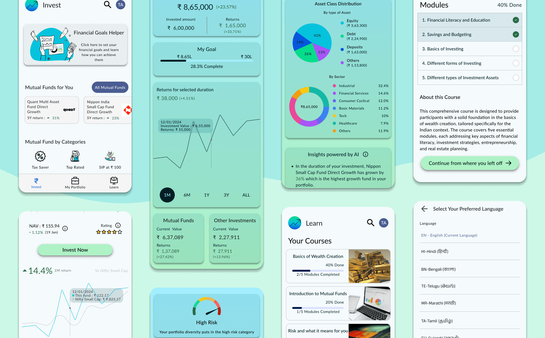
QuikVest is a concept mobile application for investing in mutual funds. Its unique value lies in its powerful learning module and availability in India's popular local languages. It also includes a portfolio management and analysis module powered by AI. It primarily targets novice investors venturing into mutual funds and intermediate investors looking to have easy access to financial educational content while also making sure that veteran investors have all the tools required for their trade.
The primary aim of the learning module is to help users achieve financial literacy and empower them to make informed decisions about investments. A blog is also attached to the learning module which gives insights and strategies provided by experts in the field.
You can play around with the high fidelity prototype here (opens external figma link in new tab) :
The Features
These are the key features which were implemented in the final product based on the outputs of the design process.
Learning Module To Promote Financial Inclusivity
Learning Module To Promote Financial Inclusivity
-
Easy Access
Readily available structured courses for novices and intermediate investors to gain financial knowledge.
-
Empowering Users To Make Better Decisions
Articles by experts to help users make investment decisions. There are also external links provided which can aid in further financial research and education.
The main design purpose is to make sure a user has access to all research material in one source
This is the type of micro user persona I used to formulate the different features of the application.
Meet Ritika, a 28-year-old software engineer who recently started her
first job. With her newfound disposable income, she's interested in
exploring investment opportunities but feels intimidated by the
financial terminology and the abundance of options. QuikVest's
learning module could be a game-changer for Ria, providing her with
accessible, bite-sized lessons tailored to her level of understanding,
empowering her to make informed decisions about her investments.
Portfolio Insights Powered By AI
Portfolio Insights Powered By AI
-
Portfolio Breakdown
Multiple methods of portfolio visualization with an easy goal visualization. Breakdowns of portfolio holdings based on asset classifications.
-
Insights powered by AI
Based on portfolio performance and current market trends, the user is delivered insights about the performance of their portfolio. Functionalities like recommendations based on AI can also be added to the app in the future.
The main design purpose is to make sure a user can save a lot of time spent to analyse their portfolio and make better decisions based on their needs.
Simple and Easy KYC Process
Simple and Easy KYC Process
-
Do At Your Convenience
Available at any time after registering as a user in the application. Only limitation is that you cannot invest without completing KYC (Govt. regulations)
-
Reducing User Drop Offs By Adding Convenience
Informing the user about the requirements at the start including approximate time it would take. Could also add KYC by Digilocker in future iterations to make the process even simpler.
The main design purpose is to ensure a smooth and easy KYC process to reduce user journey drop offs
Consistent User Flow for Investments
Whether starting a new investment or modifying existing investments.
Starting New Investments
Modifying Existing Investments
All The Tools To Empower an Investor To Succeed
- Graphs with multiple range for duration to visualize fund performances available before and after investing
- Investment calculator for a better understanding of returns
- General insights on the fund for new investments and Insights powered by AI for existing investments.
- Readily available fund holdings distribution and easy method to compare with other funds in similar class of funds.
- Easy auto pay setup (with RBI mandated method to store payment information)
- Information tooltips for financial jargon in the application to help a new investors
A Goals Helper Functionality
A Goals Helper Functionality
-
Quick Simple Questionnaire To Set Goals
A quick 10 question survey with approximate time informed at the start and a progress bar to keep the user informed.
-
App Experience Tailored Based On The Goals
Information provided in the questionnaire will set the recommended funds and also the Goal Progress Functionality in the Portfolio Visualization Module.
Investing with specific goals in mind serves as a potent strategy for users to alleviate stress and curb impulsive decisions influenced by market fluctuations. This module encompasses a robust framework with ample room for potential enhancements and refinements.
Financial Inclusivity Powered By Accessibile Design
Financial Inclusivity Powered By Accessibile Design
-
Support For the 10 most spoken languages in India
Supports English, Hindi, Bengali, Telugu, Marathi, Tamil, Gujarati, Kannada, Odia, Punjabi and Malayalam. Can be changed at either Sign Up or within the User Settings Page
Since only 30% of Indians understand English, language remains a massive barrier to economic inclusion in India. This feature was added to alleviate language barriers.
The Design Process
5-10 min Read
The Methodology
Now that you have seen the solution and the key features, you might be wondering how I decided on those. Well, this was my process.
When confronted with a challenge, I believe in thoroughly exploring existing solutions and gathering comprehensive information before attempting to develop a novel approach. My methodology involves extensive research and investigation, as I recognize that more often than not, an effective solution already exists, negating the need for unnecessary reinvention.
However, gathering relevant information for this project proved to be a significant challenge. With the vast expanse of the financial domain, I found myself overwhelmed by the sheer volume of data and resources available. However, through persistent effort, I was able to identify and leverage these authoritative sources:
A report of a well conducted survey by Aspero and Amaha, google, economic newspapers, survey results, Govt. reports, AMFI reports, market predictions, economic forums, AI bots and analysis of other competitors in the Mutual Fund space with similar offerings.
The Process
- Define
- Research and Insights
- Ideation
- Wireframes and Testing
- High Fidelity Prototype
- Testing and Iteration
The Research
In my research process, I extensively explored a vast array of content from diverse sources. However, I am particularly grateful to Aspero and Amaha for granting me access to their invaluable report, which was based on a comprehensive survey involving over 300 respondents who were mutual fund investors. Notably, this report is readily accessible to the public, requiring only the submission of one's name and email address. The availability of this resource significantly reduced the time and effort I would have otherwise needed to invest in conducting primary research, thereby streamlining my investigative process.
For primary research, I tried to get participants with the criteria for age between 21 and 60, who are either new or have never invested in mutual funds. Since it is a self driven application design, budget constraints meant that I had to depend a lot more on the secondary research.
Thankfully the report provided a lot of primary insights which would have been impossible to obtain otherwise and I could concentrate more on people who are either novice or currently not investing. I mainly used online surveys to validate the hypothesis from my secondary research.
From primary and secondary research these were the main takeaways which guided my design choices :
- The main target would be users using android due to its market share in India being over 95% of all smartphones
- There is a lack of support for popular local languages which affected accessibility and financial inclusivity.
- There is a lack of readily available educational resources tailored for novice and intermediate investors.
- According to the Aspero and Amaha report , more than 60% of mutual fund investors used online research as their primary method for knowledge seeking while 35% used either financial advisors, colleagues or friends for the same.
- Portfolio management is an area where significant USP can be created with the help of AI analysis and reports.
For my in depth research where I delve deep into all the research topics you can click this link (opens in the same tab)
Research FindingsThe Ideation
After completing the initial phase of research, I recognized that there might be other aspects I had overlooked or failed to consider. This realization prompted me to create a user journey map to further identify barriers that often hinders individuals from venturing into this domain. The affinity mapping exercise further solidified my understanding of the pain points experienced by novice and intermediate investors. This process guided me towards developing a solution that prioritized simplicity, clarity, and financial empowerment, addressing the key challenges faced by those navigating the investment landscape.
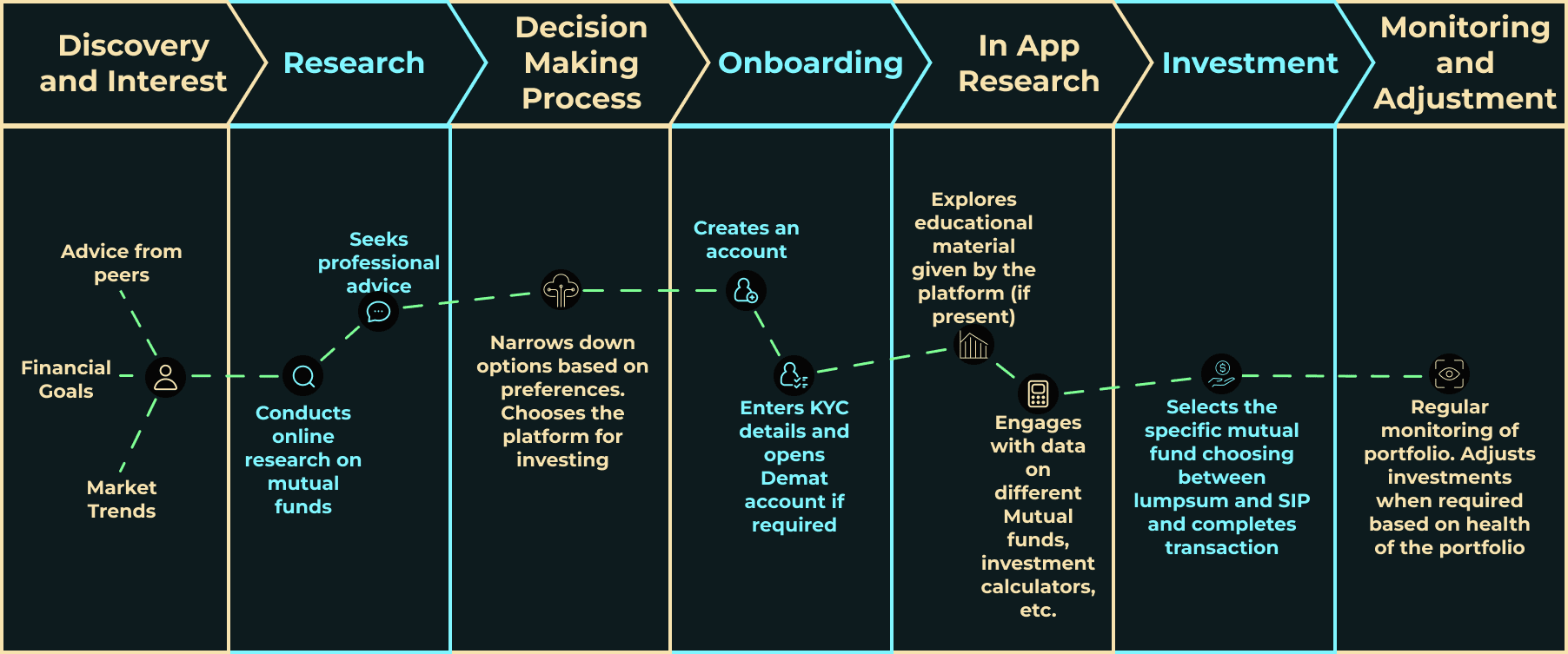
User Journey Map

Potential Pain Points
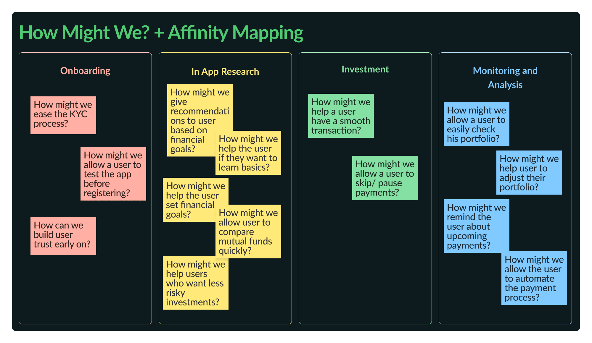
Affinity Map
As you might have noticed a few of the initial steps from the User Journey Map are out of scope for the application design. Based on the affinity mapping, I came up with a bunch of solutions for the pain points identified.
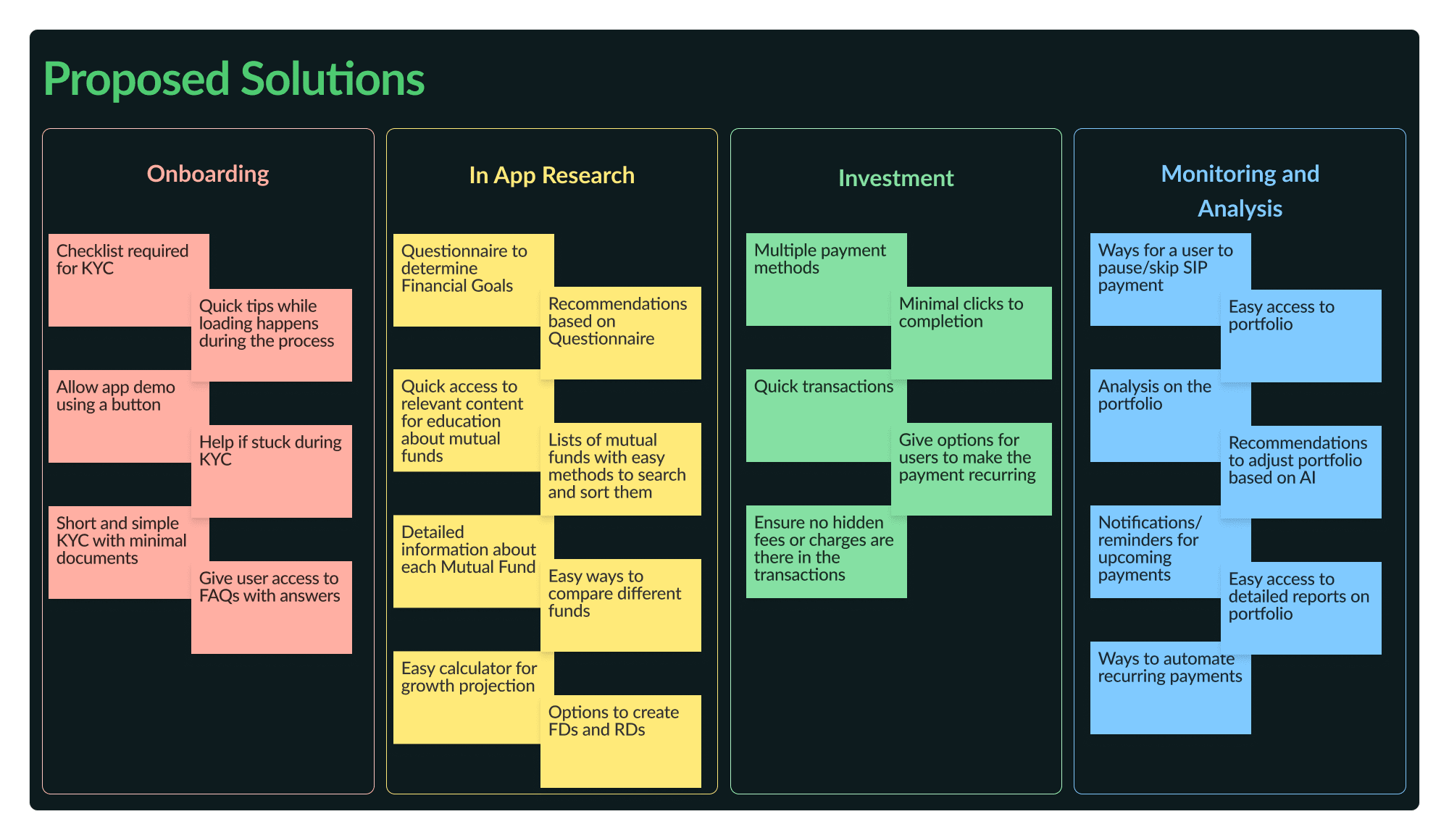
Proposed Solutions
Using the User Journey Map and the Proposed Solutions, I formulated a resilient information architecture for the mobile application, ensuring it accommodated future product expansions. And this acted as the single source of truth for my design.
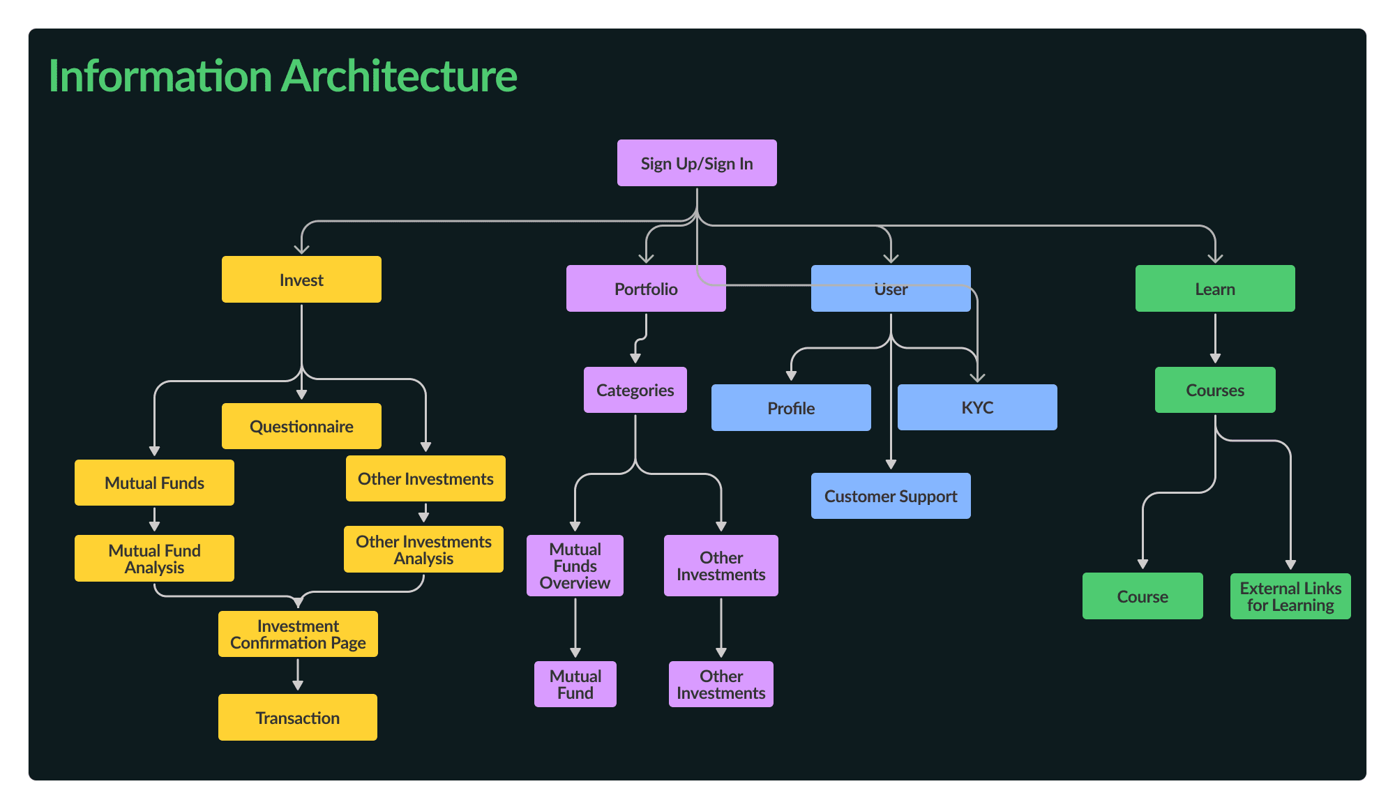
Information Architecture
The core focus was designing a mutual fund investing app that combined investing, portfolio management and a comprehensive learning module and all of these available in major regional languages. The learning module aimed to provide users with structured, bite-sized lessons to enhance their investment knowledge and enable informed decision-making.
The Wireframes
Using the IA, I plotted out the key user flows and also the mandatory user flows which were required for the app to function according to Govt regulations. And proceeded to sketch wireframes on Figma for the same.
- User Sign In Flow
- Learn Tab Flow
- KYC and User Profile Flow
- Portfolio Tab Flow
- Invest Tab Flow
Two of the flows in the wireframe are shown below are shown below :
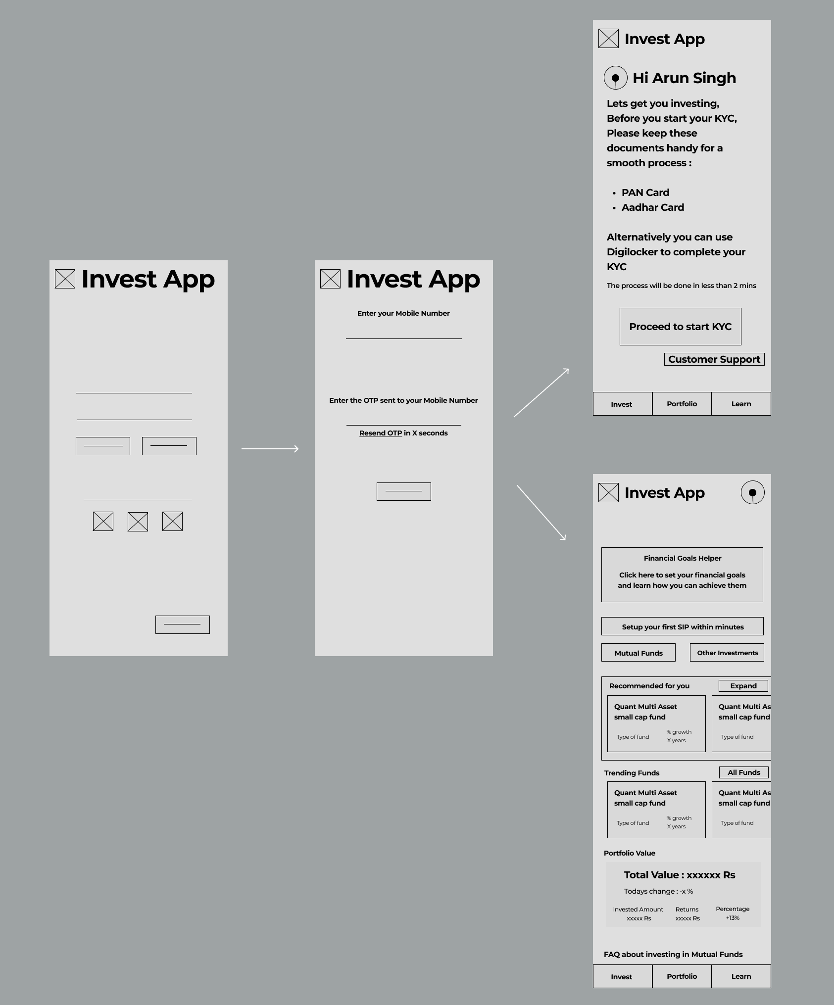
User Sign In Flow
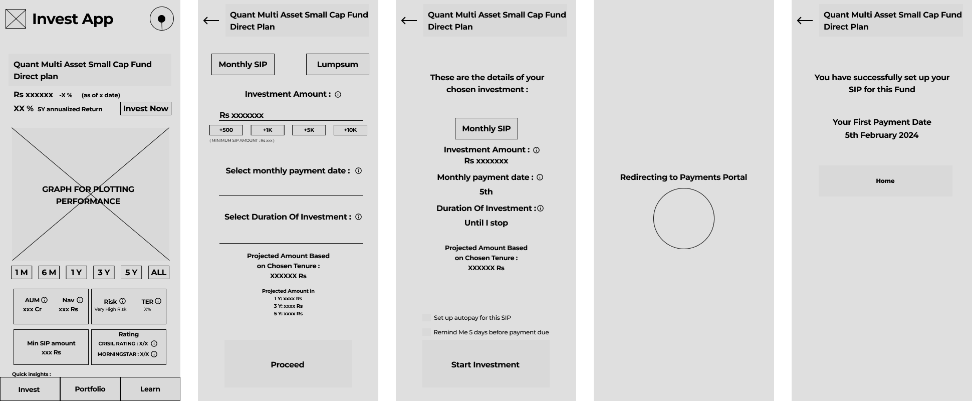
Invest Tab Flow
After the user flows were done, It was the moment of truth. To validate the wireframes, I conducted a Semi-Guided Usability Test on the wireframes using random participants and got the following feedback:
-
The initial Invest page was jarring and had way too much clutter in the top half and confused the participants about the purpose of the application

-
On the learn user flow, multiple participants were confused. They were unsure if the choices made were final and whether they would be able to opt in for the courses later if they didn't select it now

I also learned an important lesson. Placeholders didn't work as well as I thought it would when I did the Usability Test. Most of the participants were getting distracted by the placeholders not having text or images. I think that effort to add decent placeholders before testing would have helped me in getting a better output from the study.
With the suggestions from the usability study in hand, I got into the phase I was most excited to do, the mockups and high fidelity prototype. By this point, I had an inkling that I might have bitten off more than I could chew and should have stuck to just one user flow. But I decided to go through with the entire application and I was glad I did.
The Prototype
Since I knew about the monumental task ahead, I decided to use a guide so that I follow best practices and have consistency across the entire application. Based on the research findings, it was determined that the primary user demographic for this product would be Android users, which led to the decision to employ the Material Design System for the user interface, with a bit of customization of my own where I felt it was required.
Creating a cohesive and visually appealing design for QuikVest presented its own set of challenges. I wanted to strike a delicate balance between conveying a sense of trust and professionalism while also promoting a welcoming and accessible experience. After extensive research into color psychology and branding principles, I landed on a color palette that harmoniously blended shades of blue, green, and cyan - hues that evoke feelings of trust, growth, and serenity. The choice of colors was a deliberate decision, as blue and green hues are strongly associated with the financial domain.
With the help of material theme builder with these three colors as my source, I was able to get a huge palette of colors I could use for different cases. I even crafted a logo with the color panel and some inspiration from the upward trend graph symbol. For typography I went with Lato for English and variants of Anek for the 9 other languages supported in the application.

Branding and Colors
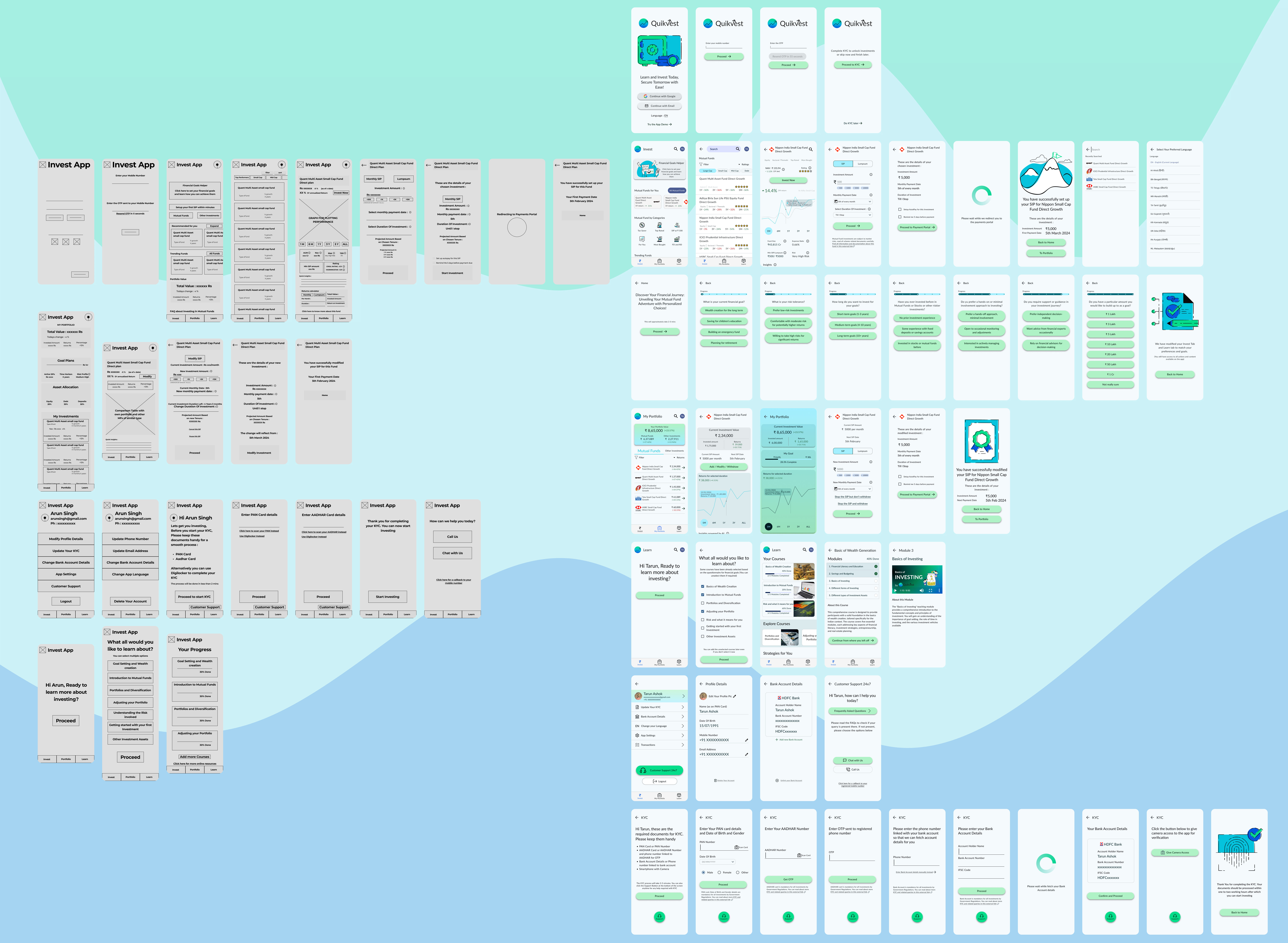
With everything in hand, I started creating the colored mockups with content. After the mockups I started making the prototypes, where I identified that several other screens needed to be added for some of the user flows to be complete. So my initial 24 screen wireframe turned into 47 screens in the final prototype.
Following an additional round of usability testing with the same group of participants involved in the wireframe evaluation, I received constructive feedback and identified a few minor issues that needed to be rectified. However, upon addressing these concerns, I reached a stage where I could confidently assert that the product had attained a satisfactory level of completeness and was prepared for final delivery. Here's a picture to give an Idea. The visibility is not great but fret not, the final prototype is available where things are clearer.
You can play around with the high fidelity prototype here (opens external figma link in new tab) :
Learning Outcome
One of the most valuable lessons I learned during this process was the importance of iterative refinement. Early on, I had underestimated the complexity of certain user flows, such as the KYC process. However, through continuous user testing and feedback, I was able to identify and address potential pain points proactively. For instance, a participant's feedback on the initial wireframes of the KYC flow prompted me to redesign the experience, incorporating clear instructions and progress indicators to enhance transparency and reduce user frustration.
Finance is a vast topic and most of my effort was spent on research. Even while in the middle of prototyping I had to do additional research, especially for the KYC user flow which is tightly regulated by the government. A vast amount of research was also required to make the Invest User Flow.
I also realized that the more thorough the research, the less need for rework later on in the design process. Also additional research at every step helped me a lot.