Landing Page For A Mental Health Professional
5min read
All identifiers (name, services, etc.) have been altered to ensure client privacy
Role : UX Designer
Time : 2 Weeks
Deliverable : Landing Page
Background
In today’s fast-paced world, where mental well-being is often overlooked, mental health professionals face a unique challenge – establishing a strong brand presence that resonates with their target audience. Building trust and creating a welcoming environment is crucial for individuals seeking support on their journey towards better mental health.
The Problem
I worked for a client as a product designer to deliver an early proof of concept for a landing page and branding guidelines for their business.
The client, in the nascent stages of their business concept, was actively brainstorming ideas. Their primary motivation was straightforward: to establish branding from the outset of their business conception.
The central objective of this project was to provide a preliminary landing page design, while concurrently deciding on a color palette, logo and other branding elements that resonated with the intended purpose ( color palette and typography are the only elements I have shared in this post. The logo, name and all other branding elements were also decided but I have used placeholders instead of those in this post ) .
The Branding Process
The first step was to identify a color for the business. The client was very actively involved in this part of the process. Our initial idea was to emulate the color of water, going for a few light shades of blue but decided against it.
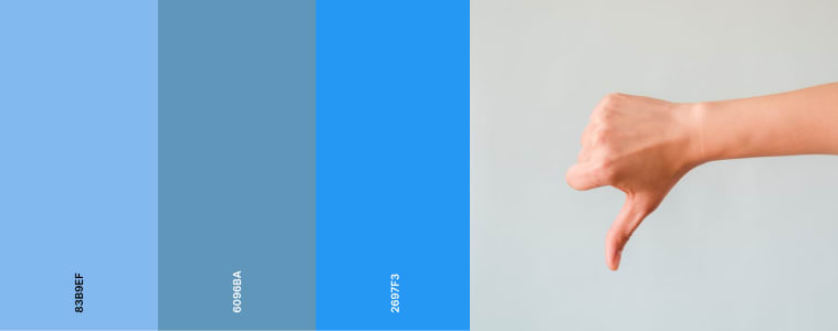
Blue had a great attribute of being a color of trust, calmness and reliability. But we had to discard blue due to how heavily it is linked with finance and money. After brainstorming a bit, we ruled out colors like white, beige and yellow. Even though they were very welcoming colors, the client didn’t want to an immediate association to “mental health” since his service was aimed at a space which includes counselling, mental well-being, relationship counselling, etc.
After careful consideration, we chose a rich, earthy shade of green – a hue that symbolizes growth, renewal, and a connection with nature’s tranquility. Just as lush forests have a calming effect on the mind, we aimed to create a brand that would evoke a sense of serenity and rejuvenation for those seeking our services.
Research has shown that exposure to green spaces, whether in the form of lush forests or urban parks, can have a profound calming effect on our minds. It has been associated with reduced stress levels, improved mood, and increased relaxation.

After the decision on the color and other branding elements (logo,name and other marketing material) were reached, the client gave me more freedom to focus on the content and the design.
Striking the perfect balance between professionalism and warmth was a crucial consideration in the typography selection. I wanted a typeface that exuded confidence and reliability, while simultaneously inviting individuals to embark on a journey of self-discovery and healing. After careful deliberation, I chose Arvo, a slab serif font that seamlessly blends the timeless elegance of traditional serifs with a modern, approachable touch.
Recognizing that the path to mental well-being is often a journey filled with challenges and triumphs, I wanted to create an immersive experience that would resonate with the target audience from the very first interaction. The animated introduction serves as a visual metaphor, guiding visitors through the transition from adversity to resolution, a powerful representation of the transformative potential of the services offered by the client.
I haven’t explained my design process in this case study, but it is similar to the design process I have followed in the Mutual Fund App case study.
You can click this to see the design process I generally follow
The Solution
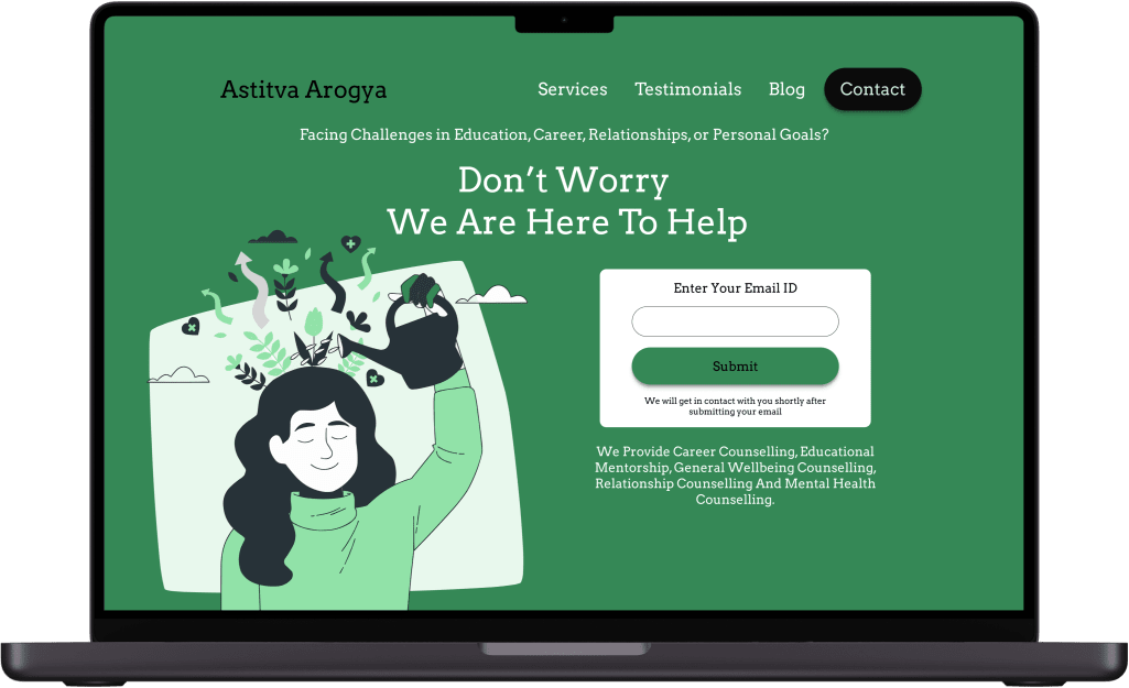
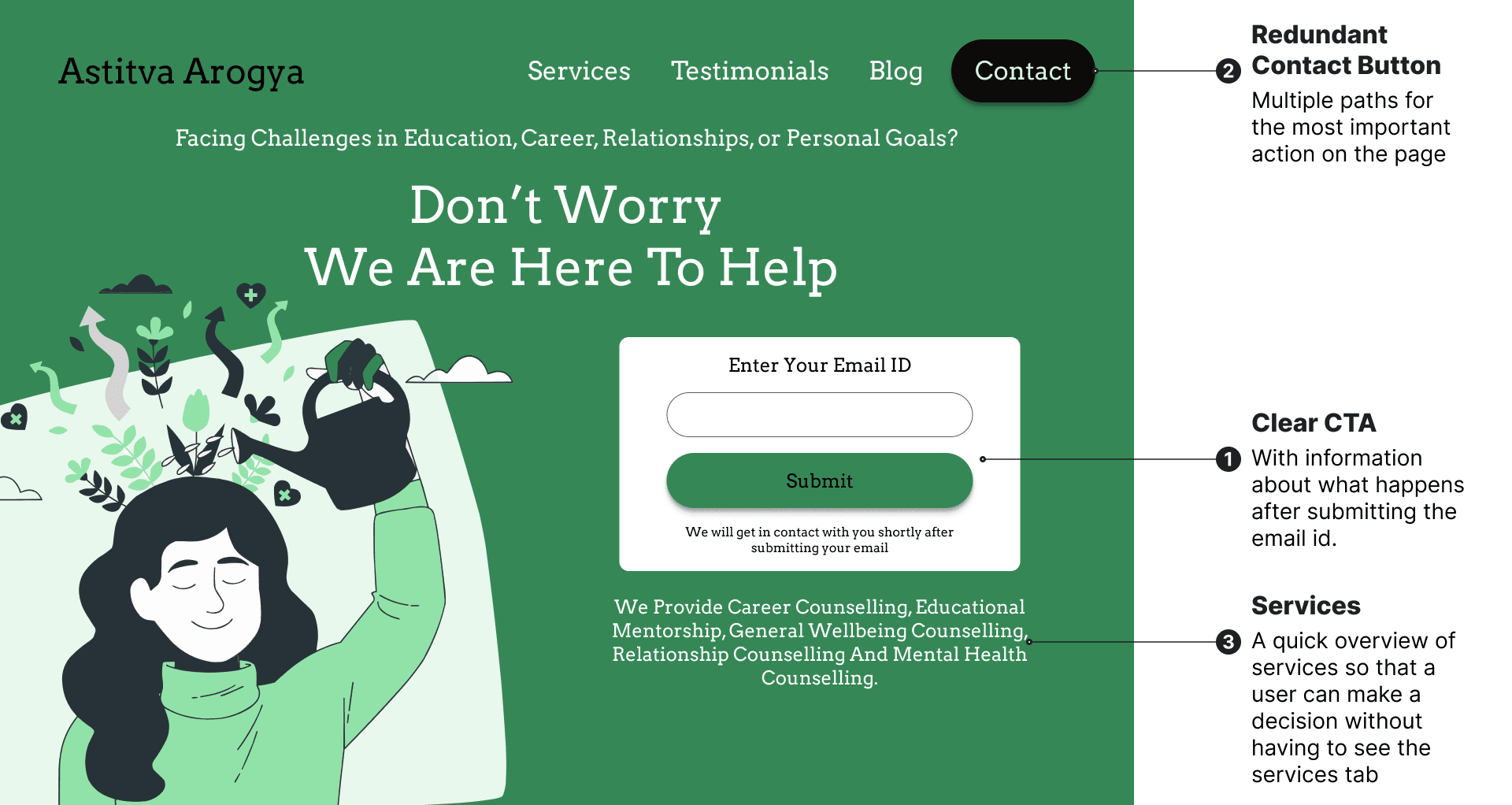
Clear CTA with additional information underneath and added redundancy by having a contact button.
Landing page with a clear CTA and communicates all the services offered. There is also a an indication of expected feedback right under the CTA to ensure the user knows what to expect.
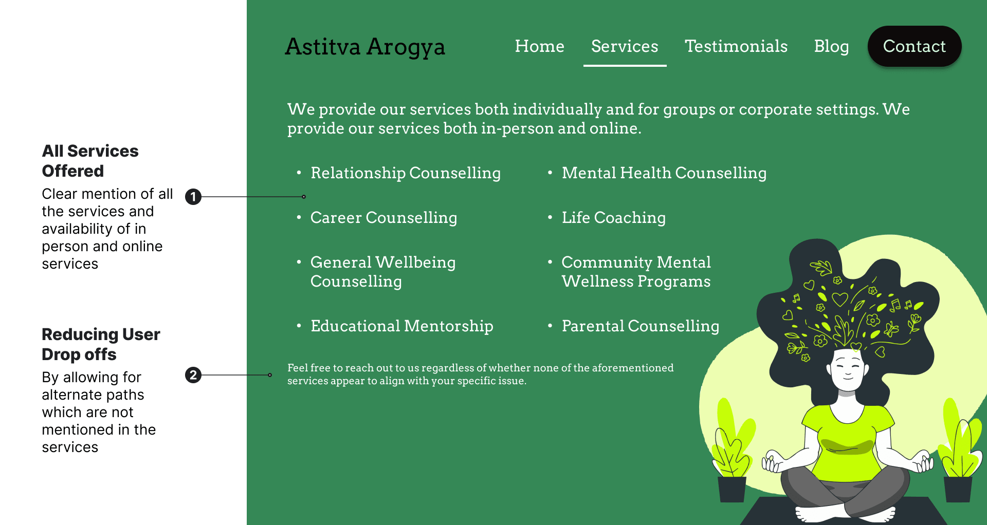
Services Page with a list of services offered by the business
The user gets a clear idea of what services are offered through the services page. Additional information at the end provided to reduce abrupt user journey drop offs which may occur when the user wants a service which is not mentioned in the list.
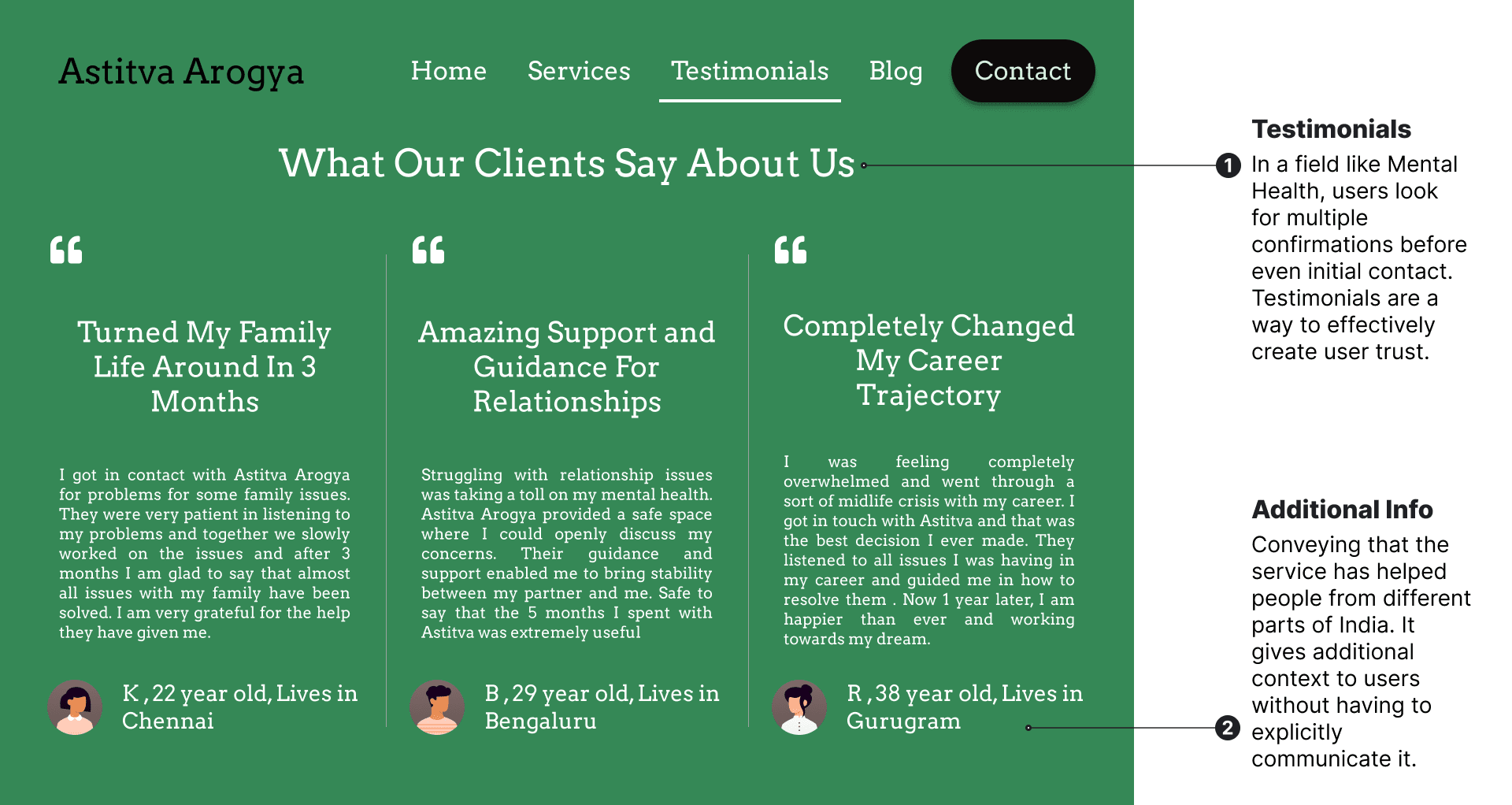
Testimonial page to build user trust and convey additional info
The user information in the testimonial is an attempt at subtle suggestion. It gives additional context to the user that the service is offered pan India, and that the mental health professional is adept at handling problems regardless of the origin of the user.
For many individuals seeking mental health support, the journey can be daunting and filled with uncertainty. That’s why I incorporated the dedicated testimonial page, a space where real stories of resilience and growth can inspire and reassure those who may feel hesitant or apprehensive about taking the first step.
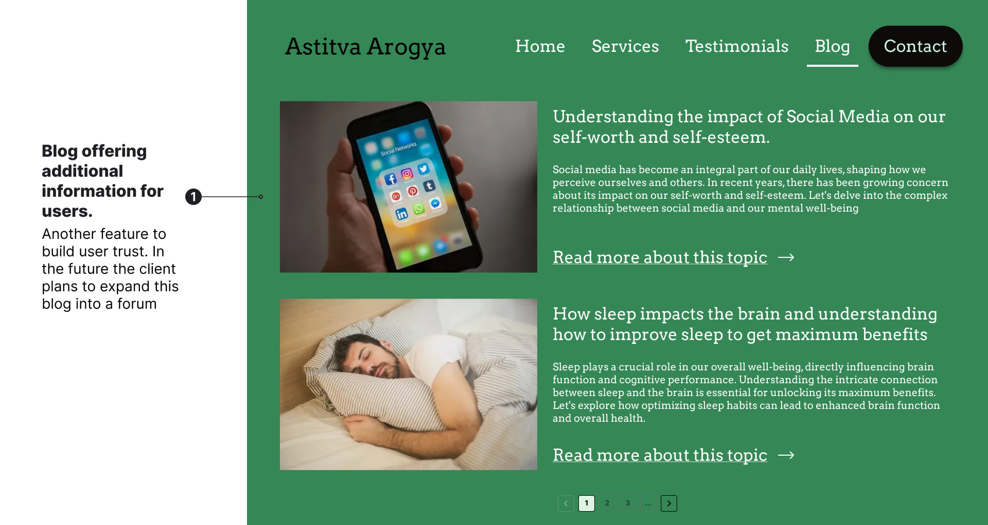
Blog offering additional information to the user
Another feature to build user trust is the blog. It gives information to the user which is beneficial for them. There’s also the possibility of a user developing additional goodwill for the business due to helpful information given in the blog. The client also plans to convert it into a forum in the future.
Final Outcome
The solution above took multiple iterations with the client. The business is still in the nascent phase so the client hasn’t committed to the design fully. But overall the client was satisfied with the current design.
Future Considerations
- The client wants the illustrations to be changed with real images when the landing page is actually built.
- The blog feature maybe completely changed or removed based on future considerations.
- In a non design related effort, I even presented a high speed, low cost architecture for the website based on my experience as a developer.